At OSCON this year we were interviewed by Rachel, Senior Editor for O'Reilly Media, about mobile game development and the state of the industry! We're working on some interested game development-related material at the moment, and can't wait to share them with you. In the mean time, check out the interview on YouTube:

We also ran our Android UX and development tutorial ("Level Up Your Apps: Mobile UX Design and Development") for the third year at OSCON! We had a great time presenting alongside our friend Chris Neugebauer (who devised much of the content).
Some links/information for those of you who are interested:
- Final APK (suitable for installing) of the OSCON 2013 app we built
- GitHub repository for the code from the tutorial
- The tags, corresponding in order to the start and finished states for the application: talk_listing_start, talk_listing_end, schedule_start, schedule_end, day_list_start, day_list_end, navigation_start, navigation_end, data_end, tabs_end, theme_start, theme_end, navigation_refresh, talk_listing_update, themeing_finished
- You can switch between these tags by using git reset --hard followed by git checkout and the name of the tag you want. Note that you will lose changes.
Slides are available on Speaker Deck:
If you have any questions or comments, please get in touch!
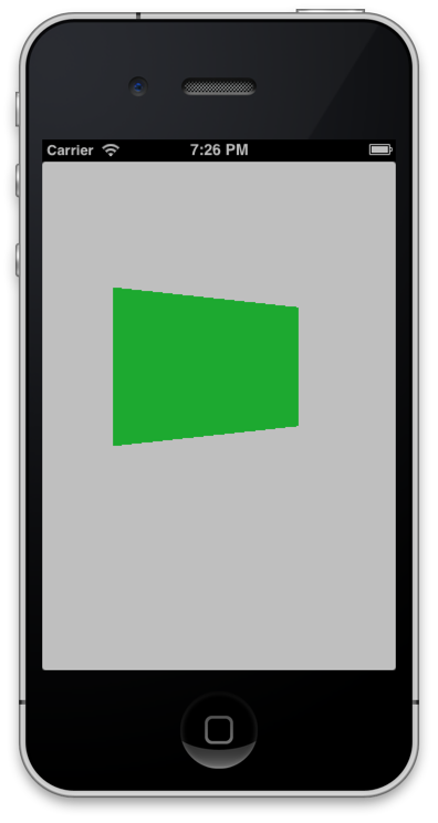
We've put a quick blog post about rotating an iOS UIView in 3D on the O'Reilly Programming Blog. Check it out!


We ran our game design workshop at OSCON 2013 this year! Thanks to all who came - we hope you had an excellent time! Here are links to the books and papers we talked about at the end of the presentation:
- Squire, 2006. From Content to Context: Videogames as Designed Experience
- Schell, 2008. The Art of Game Design
- LeBlanc, Hunicke and Zubek, 2004: MDA: A Formal Approach to Game Design and Game Research
- Koster, 2004. A Theory of Fun for Game Design
If you have any questions or comments, please get in touch!
This is the first in a series of posts about animation by Rex Smeal, animator, and friend to cephalopod and amphibia alike.
Animation techniques are usually discussed in terms of human figures. However, character animation is a very complex field, harnessing knowledge of physics, natural animal motion, conscious and unconscious physical decision-making of humans, body language, drawing and rendering styles as well as various acting styles - and that’s all before we’ve even set the figure in motion.
This introduction into animation will attempt to cut through all of that obfuscating, jargon-strangled mess, and get to the real nitty-gritty of animation: animation as it applies to ANYTHING that moves, be it a figure, a rocket ship, a bouncing ball or an interface component. Animation is both the art of bringing the lifeless to life, and the science of constructed motion, and neither of those things require a human figure or drawing skills of any kind!
Disney lists 12 principles of animation. In no particular order, they are:
- Squash and stretch
- Anticipation, Staging
- Straight ahead action and pose to pose
- Follow through and overlapping action
- Slow in and slow out
- Arcs
- Secondary action
- Timing
- Exaggeration
- Solid drawing, and
- Appeal.
ALL of this is interesting, but MOST of this is related to drawing. I’m going to whittle and compress these down to three headings, and three separate articles: Spacing, Timing, and Spatial Distortion.
In this article, we’re going to look at the first of these: Spacing.
Spacing
Spacing and Timing are very closely linked concepts, and it can be a little tricky to mentally extricate them. Richard Williams (in The Animator's Survival Kit) describes Timing as the time between the bounces of a dropped coin, and Spacing as the movement of the coin between bounces.
What this means is that if we have only one second to move an object from A->B, spacing is how we choose to move it within that timeframe. For example, if an object moves for one second, at 24 frames per second, that means I have 24 instances of the object to place across that timeline.
Sometimes, that timeframe will be open-ended, but our choices on where/how to move objects from frame to frame will still matter. Unless you’re working with some sort of amazing analogue animation device, you will be distributing objects across discrete projected frames, so your choice in how to place them should be deliberate.
Here are a few of the myriad techniques.
Eased motion. Easing is the most commonly used form of spacing, and most animation software packages have some sort of in-built easing function that allows both easing IN and easing OUT. When easing is performed automatically by software rather than defined manually, we call it “tweening” rather than “inbetweening”.
Easing means distributing spacing so that one or both ends of a timeline are compressed, meaning that an object will move smoothly out of an old position or smoothly into a new position. You can use both at the same time to give a sense of the effects natural momentum. The important thing to remember about easing is that it exists independent of timing. The number of frames does not change, just their spacing!
Anticipation/Follow-through About the only thing that moves in a straight line on regular spacing is robotic components. Even then, they’re more interesting if there’s an ‘accent’ to the way they start and finish their motion- anticipation before the motion and some sort of follow-through at the end. All human motion involves anticipation to a certain degree, we move backwards before we move forwards, left before right, etc. It’s only a slight motion, but it’s always present.
So before we move an object anywhere, it can make sense to prepare, or to spin our wheels a little first, and once we reach our destination, maybe there’ll be a little overshoot and compensation! You can take it further away from the keys - that is, the start and end points of the movement - for a ‘heavier’ effect, or make the motions faster for a springy light motion.
Arcs Technically, this is a separate issue to spacing, but it bears mentioning anyway, and here’s as good a place as any. In the real world, most things move, to a lesser or greater degree, in arcs. Even if you move along a straight line with your hand, it’s because your arm makes an arc, and your elbow and wrist make more arcs to compensate. Thrown stones, leaping tigers, ocean waves, arrows and even bullets will all arc with gravity.
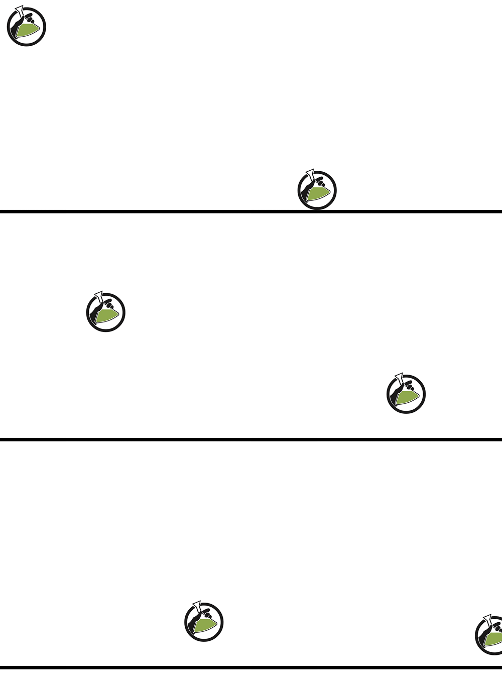
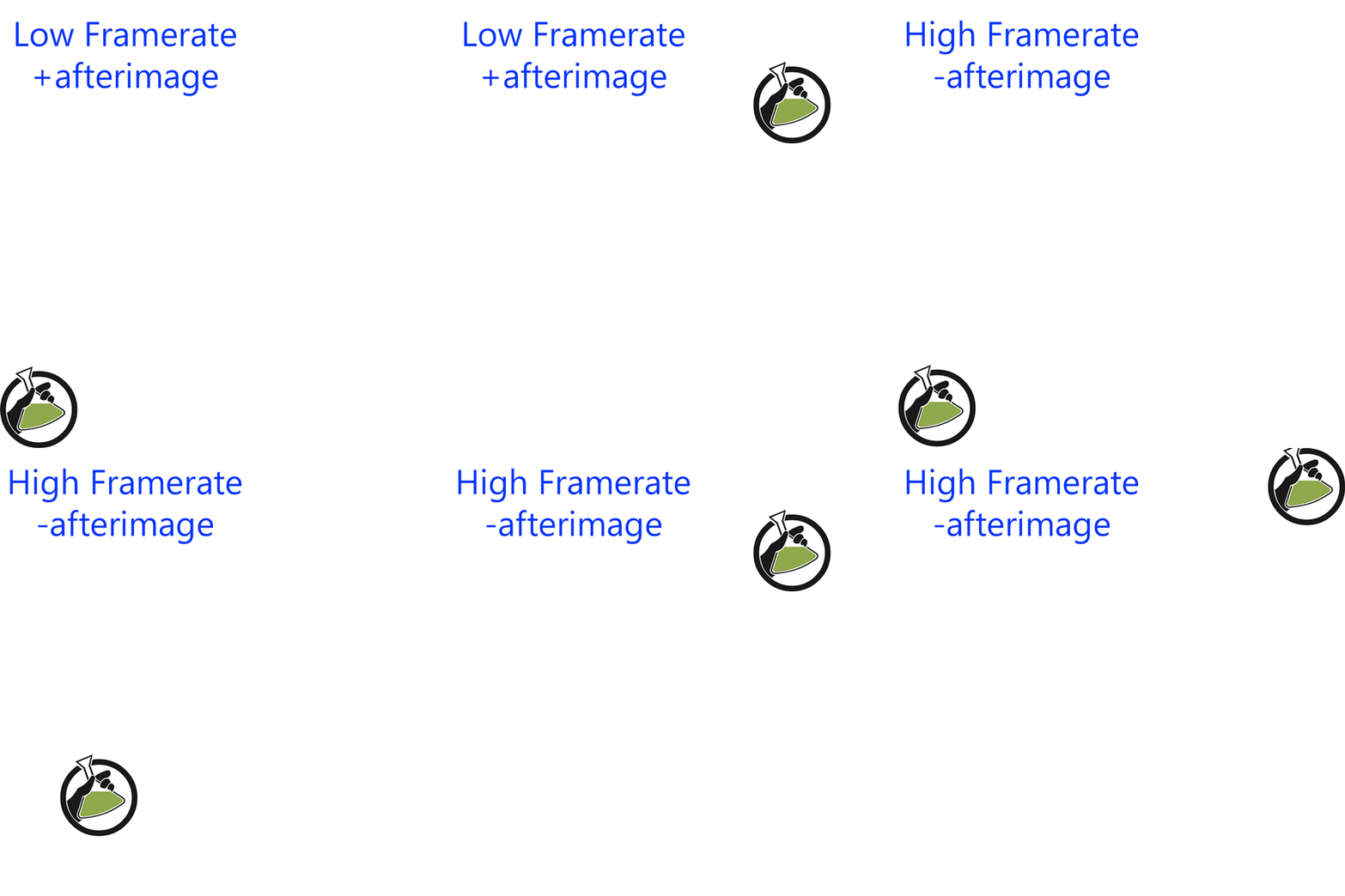
Afterimages. When spacing gets distant and the moving object is very distinct from it’s background, we sometimes see afterimages. One or more frames of the animation stand out, and leaves a kind of remembered image on your eye. This isn’t usually much of an issue if the animation is only seen once, but in a cycling animation it can make your afterimage-causing frames obvious: it reminds the viewer that they’re looking at a device that can only display images one at a time, rather than a smooth transition that can trick them into thinking that they’re looking at analogue motion.
Anyway, there are a few things we can do to beat this. Using a faster framerate (may not be practical depending on device rate/intensive rendering technique) We can play out our spacing so that there’s no such abrupt frames; if something’s moving really fast, it can sometimes be advantageous to skip these ‘afterimage’ frames. The other thing that we can do is to employ blurs, smears and distortions to negate the jarring visual contrast between object and background, which we’ll cover in later posts in this series!
Join us next time, as we take a look at how timing influences how we see animation!
 We're very pleased to be presenting at O'Reilly's OSCON conference in Portland once again this year. We're involved in two tutorials this time around!
For the first time at OSCON, Jon Manning and Paris Buttfield-Addison will be presenting a half-day tutorial on game design where they'll discuss what makes games fun, how they work, and how you can apply game design techniques to your daily non-game related work. This tutorial is hands-on, very practical, lots of fun, and is called How Do I Game Design?
For the third year in a row Chris Neugebauer, along with Jon and Paris, will be presenting a half-day tutorial on mobile application development with a focus on user-experience. As with the last two years, we'll be using Android as the platform we discuss the most – but everything will be applicable to all mobile platforms. The tutorial is called Level Up Your Apps: Mobile UX Design and Development.
We hope to see you at OSCON!


